http://alisonmeineke.wordpress.com/2014/01/27/final-color-emotions-pictures-only/
For now this will have to do! I apologize for the inconvinence, but it seems as though Weebly will not let me upload my pictures because I don't have a certain Flash program (which I do, but the evil internet likes to pretend I don't). The link above will send you to my secondary website on Wordpress! Again, sorry for the trouble!
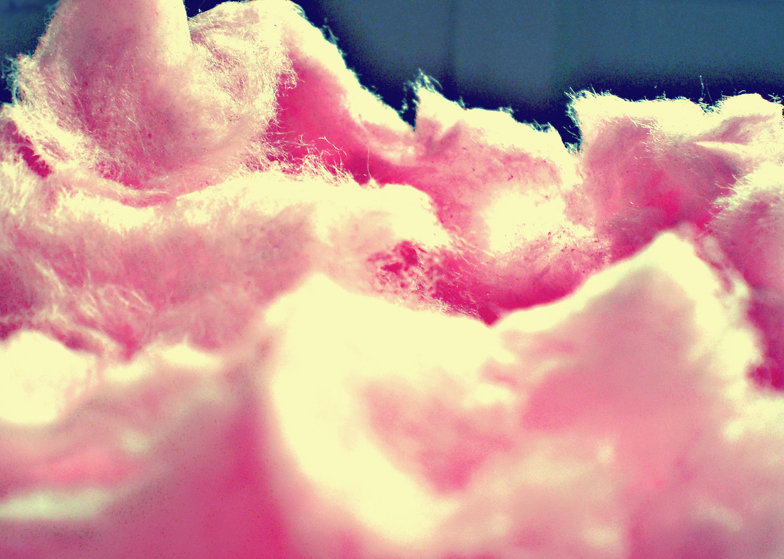
Annoyed
This one is suppose to look ridiculous on purpose! I wanted to actually make this picture look so annoying to look at that you can't look at it anymore! Everything from the colors--those blindly neon pink and orange--to the weirdly random swoop of pink and the bright orange spot in the top right corner is suppose to give a feeling of displacement and disharmony. Also the text and the faint picture of what appears to be "Annoying Orange" are intended to either make you roll your eyes or wince at the sight of the elements.
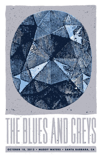
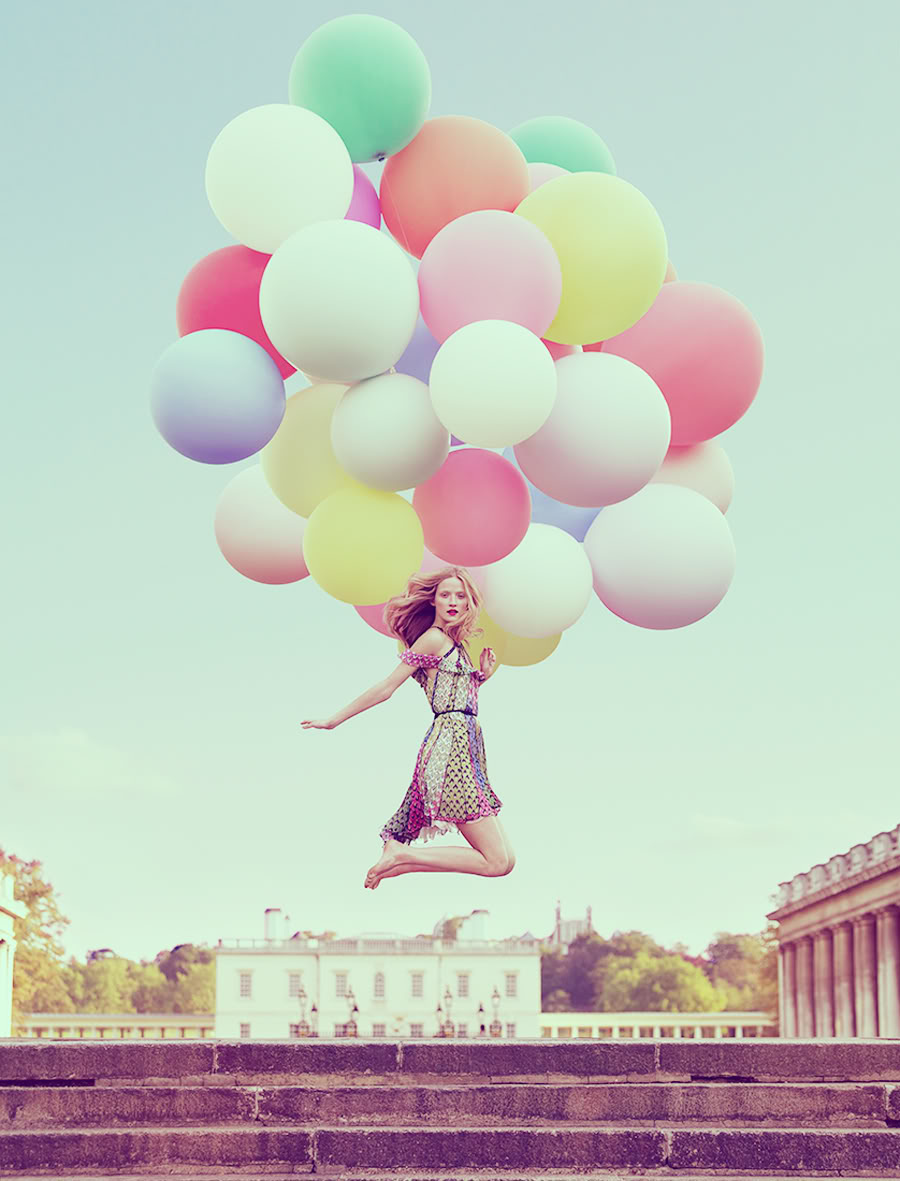
Conflicted
I hope this is okay, but "conflicted" was not a part of my list of emotions for the project. I was intending to do "elation" as a part of my final and I could not get the ideas I wanted translated on to photoshop. I spent a considerable amount of time--possibly 2 hours--trying to figure out how to fix this runt. As I was playing around with my balloon picture with the tools/filters I noticed an emotion that stuck out to me. The twisted and melted look of the pastel colors and the dim grey made me see not elation (obviously), but a sadness. I went back onto my blog to see if this image could be appointed to a previous emotion on my list. The closest I could find was "grumpy"! So I added some grey-blue hues to the image and drew on some smokey/foggy effects to give a more distinctive feeling to the picture--aiming for grumpy, but it didn't look like that in the end. I finally sat down and looked at it and saw that it was neither grumpy or elation, but conflicting! I'm hoping that you see this too.
Thanks for reading! Hope I made my thought process a little more clearer!
~A
For now this will have to do! I apologize for the inconvinence, but it seems as though Weebly will not let me upload my pictures because I don't have a certain Flash program (which I do, but the evil internet likes to pretend I don't). The link above will send you to my secondary website on Wordpress! Again, sorry for the trouble!
Annoyed
This one is suppose to look ridiculous on purpose! I wanted to actually make this picture look so annoying to look at that you can't look at it anymore! Everything from the colors--those blindly neon pink and orange--to the weirdly random swoop of pink and the bright orange spot in the top right corner is suppose to give a feeling of displacement and disharmony. Also the text and the faint picture of what appears to be "Annoying Orange" are intended to either make you roll your eyes or wince at the sight of the elements.
Conflicted
I hope this is okay, but "conflicted" was not a part of my list of emotions for the project. I was intending to do "elation" as a part of my final and I could not get the ideas I wanted translated on to photoshop. I spent a considerable amount of time--possibly 2 hours--trying to figure out how to fix this runt. As I was playing around with my balloon picture with the tools/filters I noticed an emotion that stuck out to me. The twisted and melted look of the pastel colors and the dim grey made me see not elation (obviously), but a sadness. I went back onto my blog to see if this image could be appointed to a previous emotion on my list. The closest I could find was "grumpy"! So I added some grey-blue hues to the image and drew on some smokey/foggy effects to give a more distinctive feeling to the picture--aiming for grumpy, but it didn't look like that in the end. I finally sat down and looked at it and saw that it was neither grumpy or elation, but conflicting! I'm hoping that you see this too.
Thanks for reading! Hope I made my thought process a little more clearer!
~A


 RSS Feed
