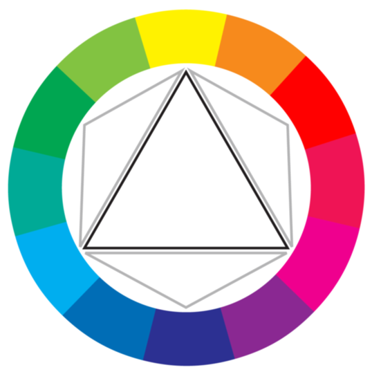
As I was halfway along in my project, I started realizing that I wasn't working in RYB like I thought I was! I was using very vibrant blues, pinks, and reds that pointed more to the CMY color wheel instead!
I didn't know that there was even such a thing as more than one color wheel, to be honest. I thought that RYB was the universally know set of colors that everyone followed--which is true, I guess to an extent, but then again I didn't realize how expansive and open-ended color theory was in the first place! To my understanding, this color wheel is used for printing--which makes sense because these colors are bright and more eye-catching compared to the more dull RYB And RGB! I think this color wheel, as an artist, is more explorative and exciting to experiment with! Although some may think the lack of integration between colors on the wheel can be annoying/unhelpful, I think it's a great challenge to hunt down what should be between those colors! Here is my final piece for our Color Choices! For some reason I had trouble getting the canvas on Photoshop to line up the pictures correctly, so some of the images may be cut funny. (I tried to fix these as much as I could.) A few things about this project: (1) Probably the hardest part about this project was getting this images to line up in an correct and efficient manner! What helped me accomplish part of this problem was some tips from ArtV201 (Intro to Computer Graphics) in which you can hold "shift" and drag multi. layers into other layers. And holding "option" which moves the layer/image around! (2) I also struggled to get some of my colors on parts of my images to fully transfer to a chosen color. For example, #14 is a Complimentary picture and I could not get the entire area orange like I wanted. It wasn't until I was writing this post that I figured out I could have used the brush tool under the mode "color" and colored in the missing orange! Whoops! (3) I noticed that I like vibrancy and clear colors! I think some of my favorites are #8, #4, #1, #7, and #28 (partially because it's purple and that's my favorite color.) The others are ones that I thought I was successful with and/or had great color saturation! (4) Ones that I don't like: #3, #13, #11, #17, and #16 because I feel like some of them had bad color schemes and others didn't have enough contrast! 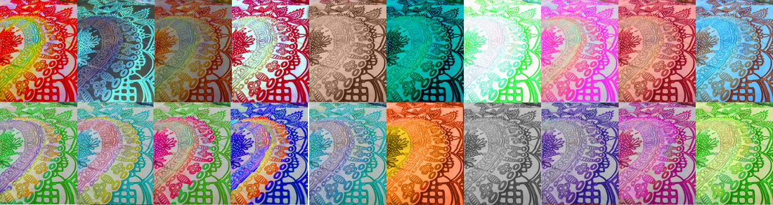 |
AuthorHi, my name is Alison! I'm currently a art student studying computer graphics. Archives
May 2014
Categories
All
|
 RSS Feed
