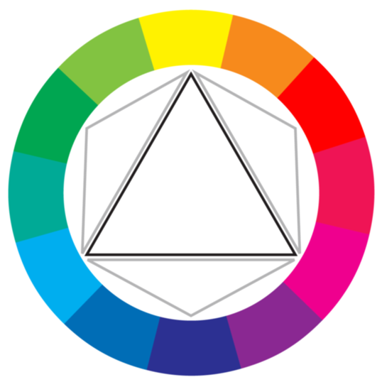
As I was halfway along in my project, I started realizing that I wasn't working in RYB like I thought I was! I was using very vibrant blues, pinks, and reds that pointed more to the CMY color wheel instead!
I didn't know that there was even such a thing as more than one color wheel, to be honest. I thought that RYB was the universally know set of colors that everyone followed--which is true, I guess to an extent, but then again I didn't realize how expansive and open-ended color theory was in the first place! To my understanding, this color wheel is used for printing--which makes sense because these colors are bright and more eye-catching compared to the more dull RYB And RGB!
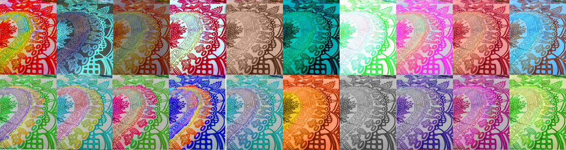
I think this color wheel, as an artist, is more explorative and exciting to experiment with! Although some may think the lack of integration between colors on the wheel can be annoying/unhelpful, I think it's a great challenge to hunt down what should be between those colors!
I didn't know that there was even such a thing as more than one color wheel, to be honest. I thought that RYB was the universally know set of colors that everyone followed--which is true, I guess to an extent, but then again I didn't realize how expansive and open-ended color theory was in the first place! To my understanding, this color wheel is used for printing--which makes sense because these colors are bright and more eye-catching compared to the more dull RYB And RGB!
I think this color wheel, as an artist, is more explorative and exciting to experiment with! Although some may think the lack of integration between colors on the wheel can be annoying/unhelpful, I think it's a great challenge to hunt down what should be between those colors!
 RSS Feed
